2019 SEPTEMBER
Cards Redesign!
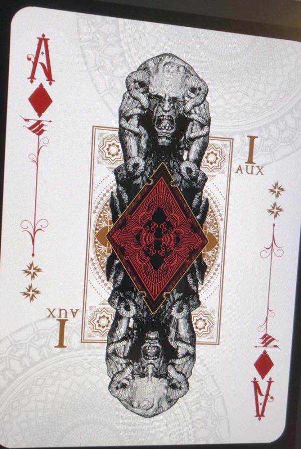
OMG they kill me! There are so many! Sometimes you just have to grind. Change, print, cut, change, print, cut. It's a mess. But I have a good pipeline and a good workflow.
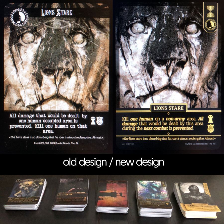
I have set myself the task to make it in 4 weeks, so that the design of the cards can finally be called "final". The cards are now super easy to read. The font is used in bibles! I think it fits perfectly to the game.
Everything looks clean and tidy now! I am very proud of the work I have done.
Another feature are the small symbols next to the text. I call them "preview icons". The player can read from these icons what the card is doing without having to read the text. When he reads the card, he automatically understands the icons...
That would be the optimal situation. Maybe I'll have to change them again in the future, but the icons were well received by the players so far. The symbols are also explained on a special card.
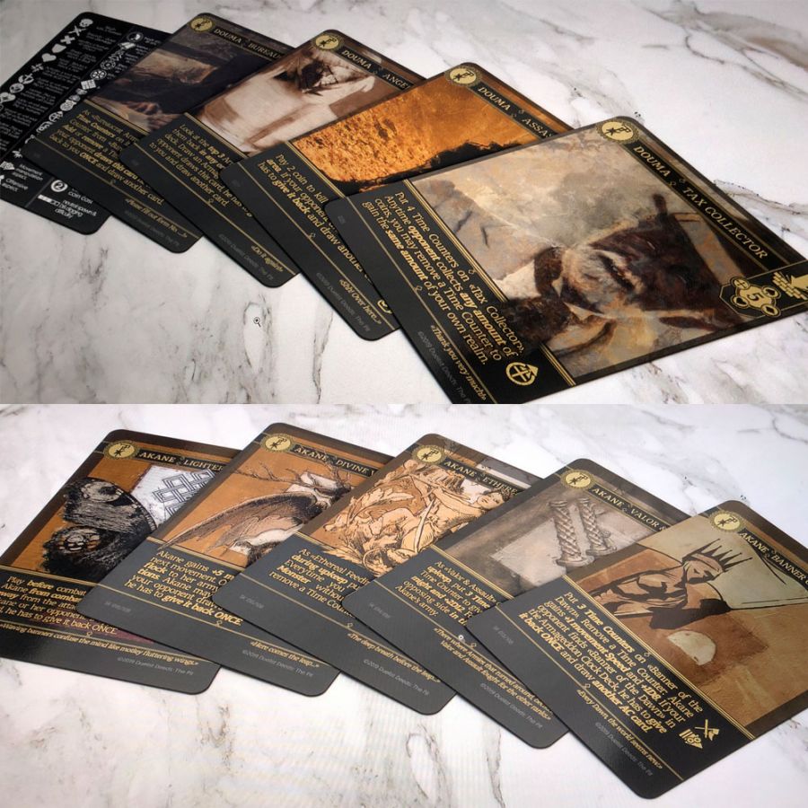
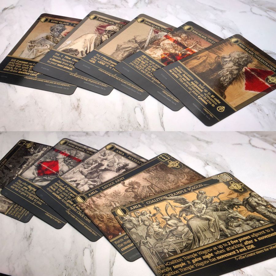
Here you can still see the amount of cards I have redesigned since last month. It's not even halfway through.
DIFFERENT TYPES AND FUNCTIONS
The most important thing was to find the color combinations and create a template for all the different types of cards. From then on it was just a grind. I saw a lot of interesting things on Youtube during the month and learned a lot while I was redesigning all the cards. Thanks god for the TED talks! :D
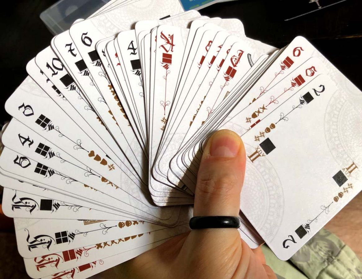
Here you can see the evolution of the battle cards... 3 different versions of the same 54 card deck... 150 different cards in total... and this was definitely not the last version. You always think: Yes, it will stay like that... for a day or two.