2020 NOVEMBER
HOW I CREATE ARTWORK for cards
This is a picture as an example of how I made artworks for my cards. This is a public domain image from an old master that i combined with a small putti from another old master from another image.
this card was meant to show that a guardian angel watches over loved ones. he acts like a shield for the soldier.
of course today there is artificial intelligence with which a single developer who has such a large project in mind can create images, but even today you can't do it without photoshop and without combining several images into one if you want to achieve the desired results.
more on this in future posts (for example in 2023).
QUALITY & Throwing stuff away
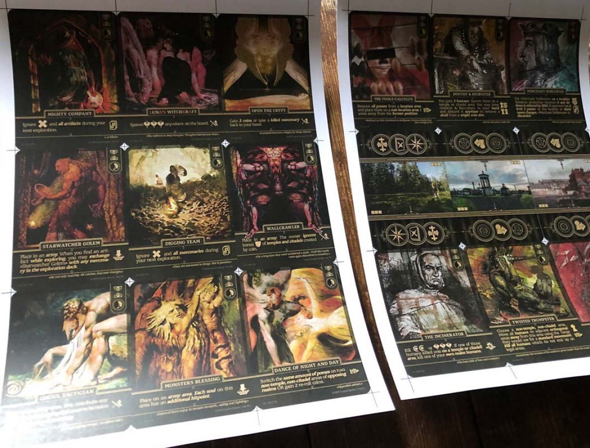
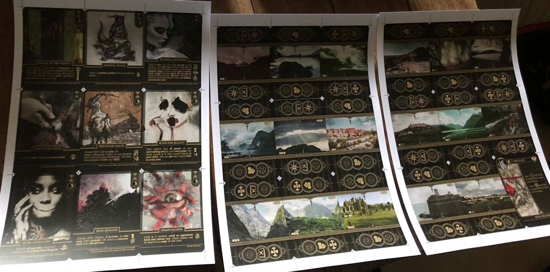
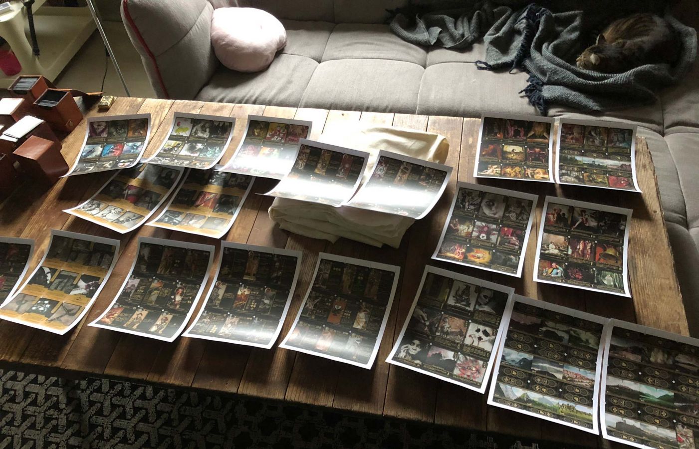
As I wrote before, there is a company in Germany that produces playing cards. You can order a single deck of 24 cards in poker size from this company. With shipping costs this costs about 20€. It is a bit expensive, but you have to make this investment to see how a printing machine handles the colors. What I have noticed is that you often have to work with higher contrasts and with a higher brightness.
It is also problematic if the contrast between the text and the background is too low. I often have this problem because I want the beautiful images I have created to show through the text field to achieve this "borderless" effect. However, this is totally counterproductive for readability. I've gone more and more to making the text box darker and the text color lighter. So that the color only remotely resembles gold. At some point I also switched to a text size of 9 points instead of 8.
What always amazes me is how small the text on magic-the-gathering cards sometimes is and yet the text is still perfectly legible. I think this is probably due to the font or the fact that as a long-time player who has been reading magic cards since 1993, you are so accustomed to what is written on these cards that you have no problem understanding them. At least that's something I suspect. I think it probably has something to do with a "habit factor", as nothing I've tried so far has been as easy to read as magic cards.
For example, if you're used to American movies where the "blockbuster" cinematography is very polished and formulaic (in the best sense), you don't get along so well at first with a French independent movie, for example, that uses axis jumps to create chaos and disorientation. I think you also have this kind of imprint on design and user interfaces.
Design should be based on the best. If you want to see something that's polished down to the last detail, there's no better place than Apple, Disney, Riot Games or Blizzard. When something is released by these companies, you can be sure that 95% of the work that went into the final published material was thrown away.
I don't measure it that high, but I think it's maybe 60-70% for me. I think that's a pretty good rate. I don't know if that's normal either.
When I studied at the Film Academy, I had professors from Disney who advised me on my projects. That's when I realized how precisely they work there and how often things that were actually already good were thrown away again because they didn't meet the standard. This quality standard, also from other companies like Crytech or from other directors I've worked for over the years, has been so extremely instilled in me that I can no longer accept anything that doesn't meet a certain standard.
However, this does not apply to my very sloppy "development blog"! :D
Because I have way too much work to do these little notes 100%. Sorry guys! But if I've talked about something you want to know more about in the future, I'll set up a Discord channel for the people who are interested in the game.


Being tough with yourself and your stuff
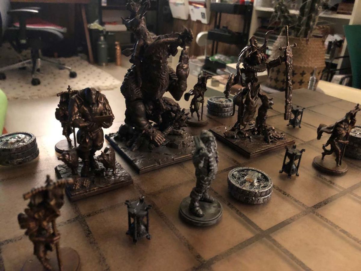
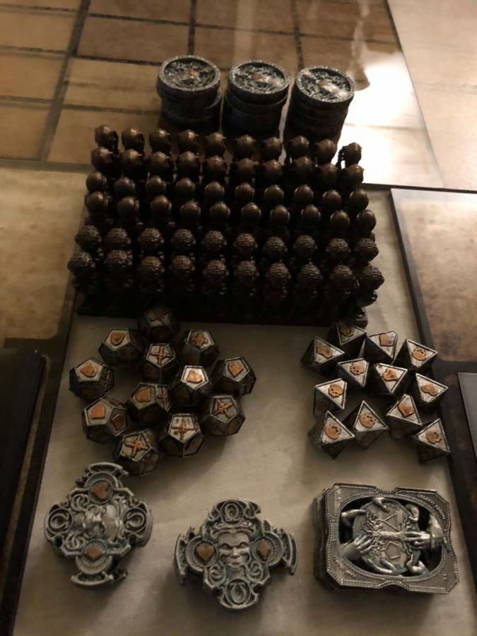
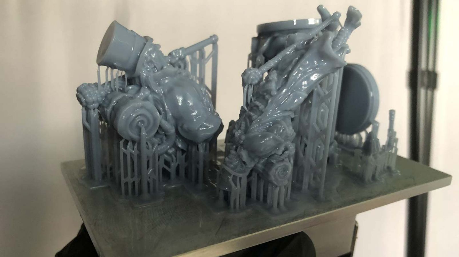
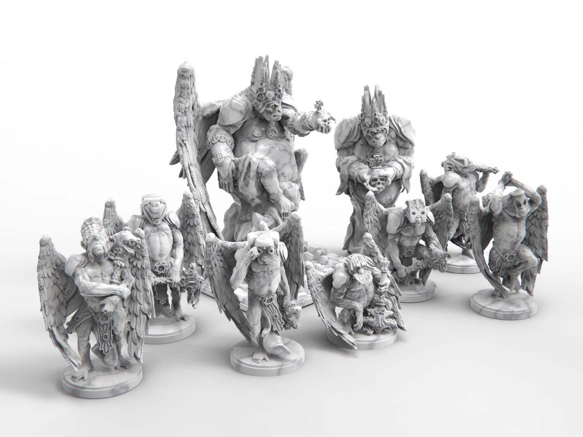
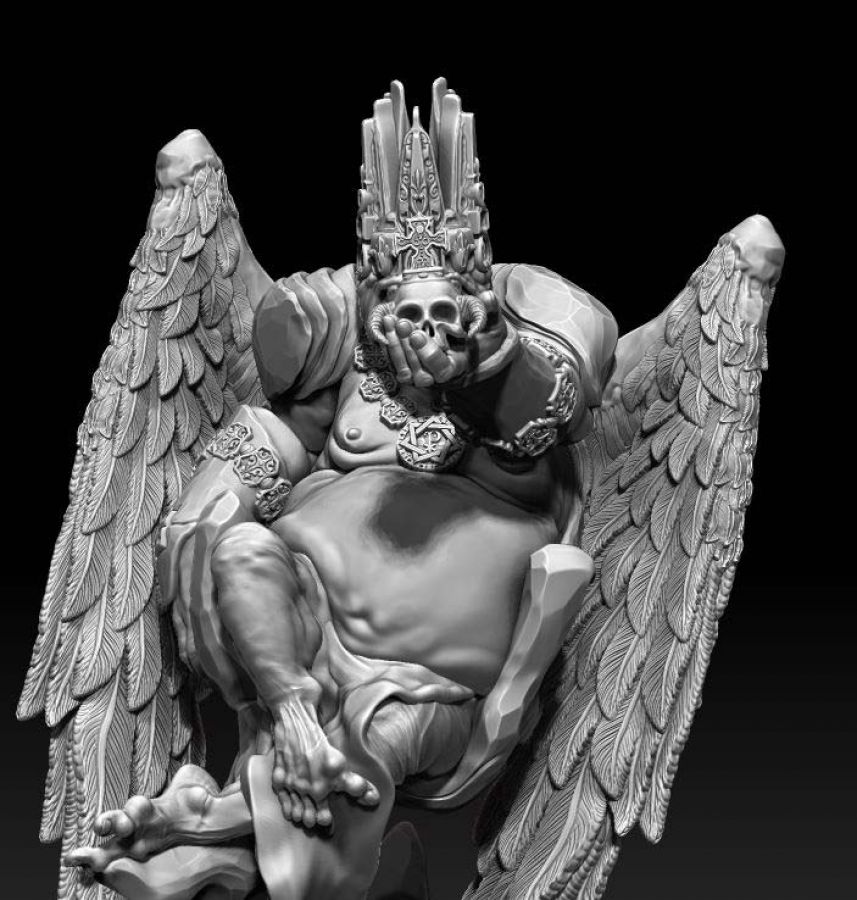
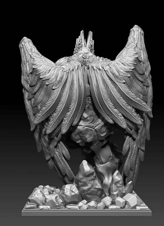
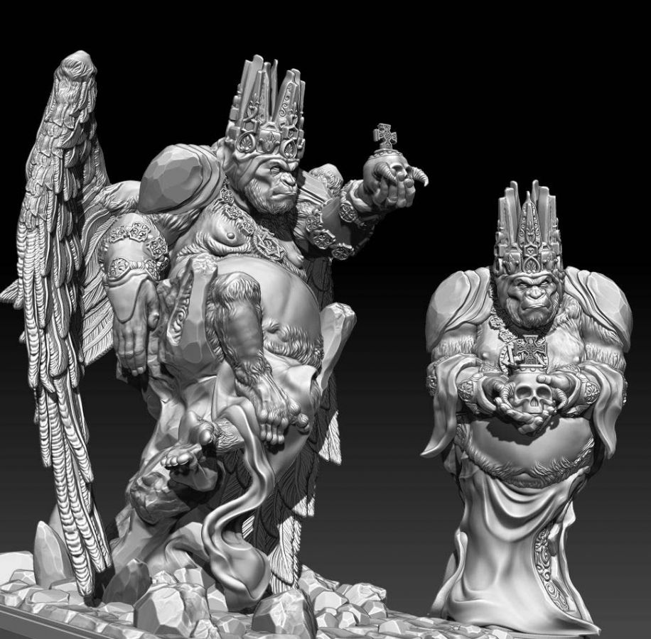
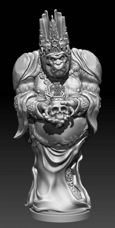
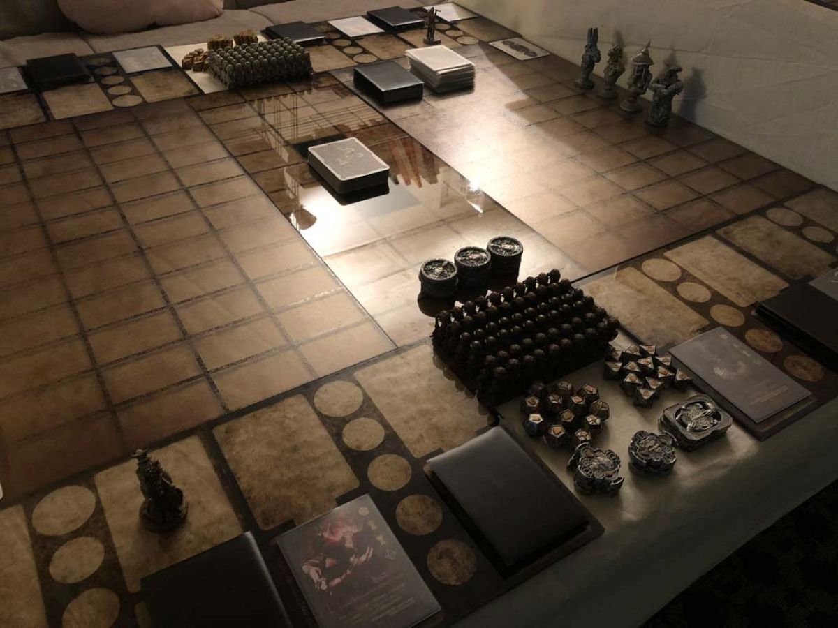
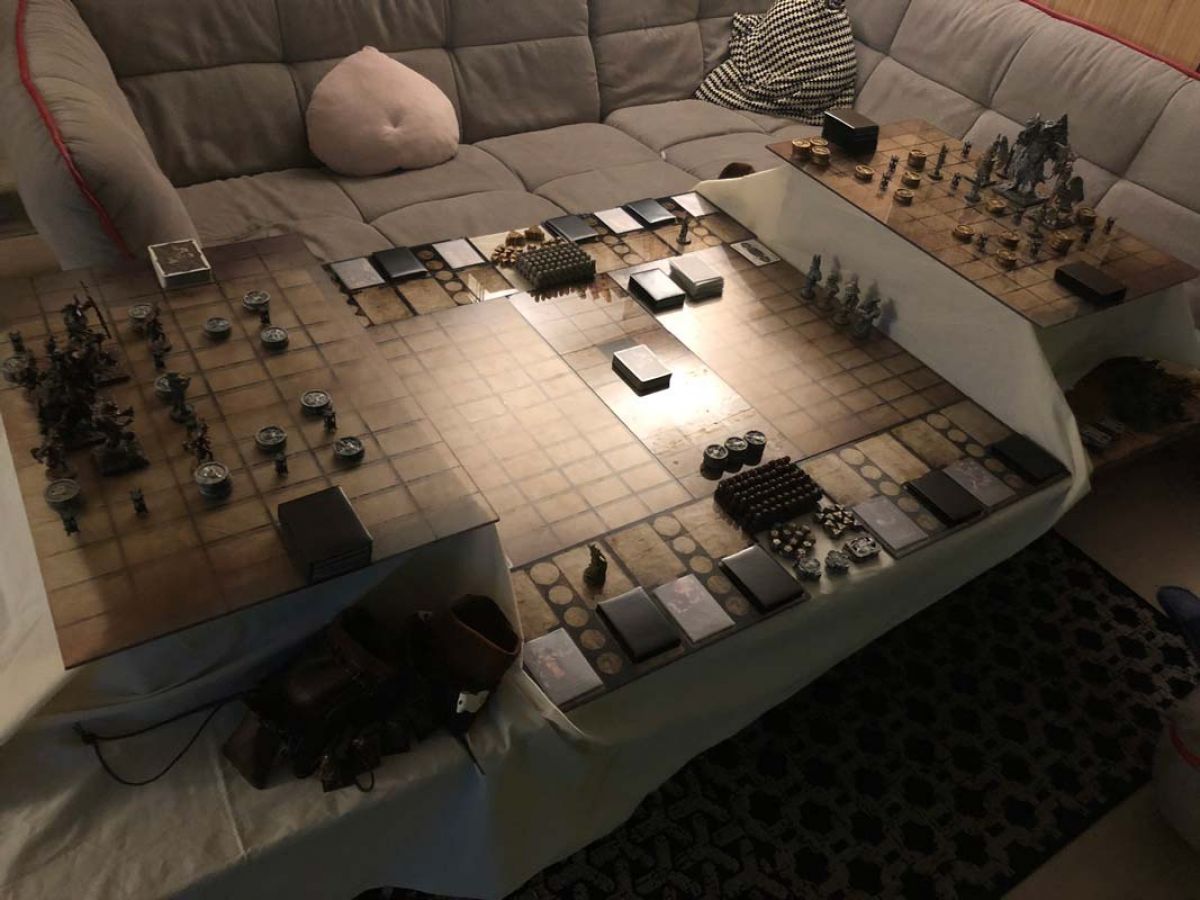
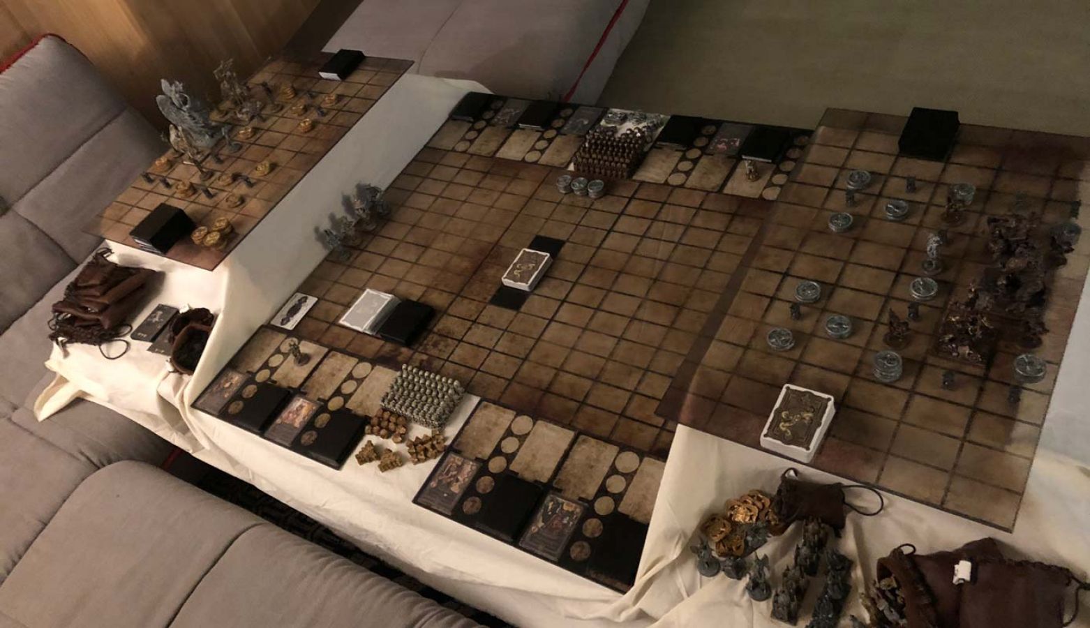
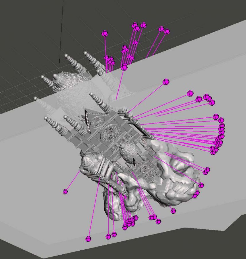
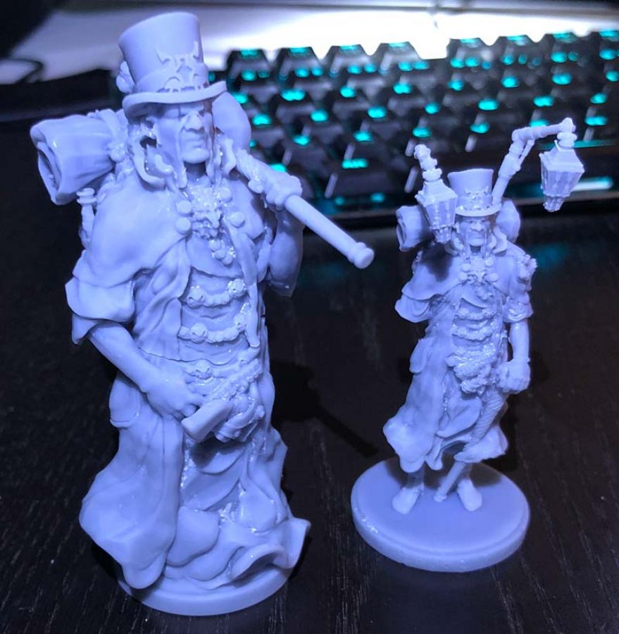
This month I worked a lot on two miniatures. A level 3 angel and a champion. I also made and printed a lot of cards, as they now have to be oriented very differently (with the new layout of the game board).
Everything you change always has a lot of consequences. You often think to yourself: "Oh shit! I have to redo all that too!" But then you sit down for 18 hours a day for a week and everything is up to date again. You also become faster and more hardened.
Once you've overcome the pain of throwing things away a few times, at some point you don't even feel it anymore. That's a good thing. You realize that you're not made of sugar and that what you do isn't "sacred".
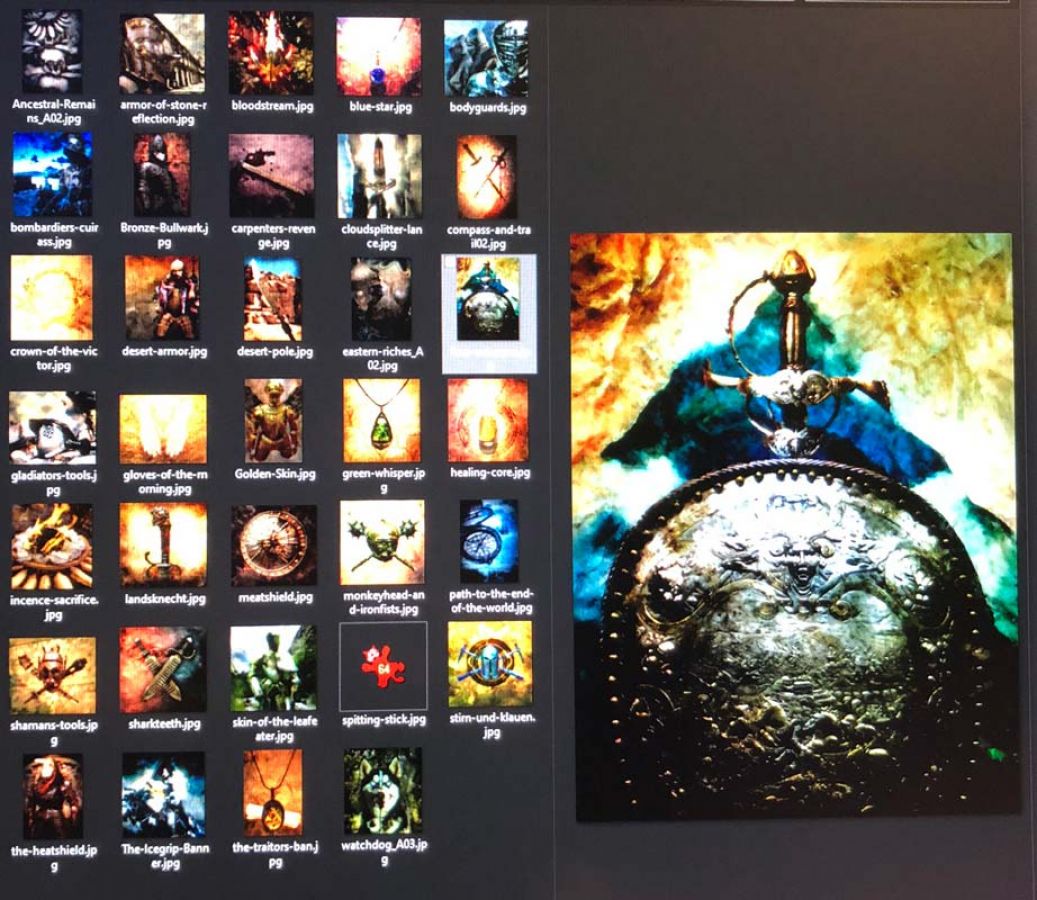
You can see the stuff I made in the gallery.